Thursday, August 13, 2015

Throw Back Thursday

It's been a few weeks since I messed around with paper that wasn't littering my pantry or other areas where my purging/cleaning hands have been.  And while messing with that paper has a certain feeling of satisfaction, it's not quite the same as cutting and pasting it along with photos.


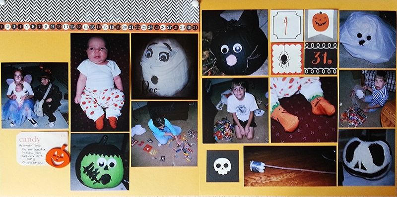
I have to say, when I'm out at a crop, I do a pretty good job of making the most of my -out-of-the-house time.  Thanks to using Apron Strings kits I completed four layouts at the last crop, of which was this one using the Pebbles, Inc. Thirty-One line found in the October Bigger kit.  

Halloween being my second favorite holiday, it's hard for me to resist anything Halloween themed, but I look forward to working with it all.  I have no clue what I'll do when the last of the kids ceases dressing up.  Luckily, I have a 6 y.o. who is some time away from hanging up his trick-or-treat bag, plus I have a decent back-log of photos.

With this layout I went simple - which, let's face it, is my jam.  I had plenty of photos, 12 to be exact, so paper and embellishments were at a minimum.  I like modified grids when I have a lot of photos, it's just easier.  Easier to adjust sizes and fill spaces.  I filled my empty spaces with blocks I cut from a grid patterned paper and the journaling block, which was just bullet list of what each of the kids dressed up as.  I was missing one child, and for the life of me couldn't figure out what or where he was.  I discovered he was attending a party as Charlie Brown the Ghost.  My only defense in missing a photo of him in costume was that I had a one-month old.

I used very little of this Bigger kit - a strip from patterned paper and several blocks cut from a grid paper, plus a couple brads, the pumpkin button and a flash card I used for a journaling block.  Because so much of the kit remains, it'll go back into my stash as a kit (rather than breaking it apart.)

Happy  Thursday,

Wednesday, August 12, 2015

We Are

We are drawing near the start of school for everyone.  The High School Freshman starts next Monday, the High School Junior starts Tuesday, we move the College Freshman up on Thursday (I can't even) and the Second Grader - yeah, not sure when his start day is.  I think it's probably next week, but it could be the following Monday.  I probably should figure that out.

Colorado Peaches are in and they are stinkin' huge - softball sizes.  We'll be heading out to the Peach Festival this weekend to load up on them. I'd still like a drive out to the Western Slope to pick a few, even though we'll be up to our eyeballs.  It'll be peaches with everything. We'll stuff ourselves until we've had enough to wait until next year's crop.  I'm sure there will be canning involved.

Considering this is the week before school, it was relatively quiet.  I know I totally spaced out one thing, and given that, I'm hesitant to find what else I forgot that made the week so quiet.

Week in the Life starts on the 17th, so I will probably be doing some version of it.  Especially since it falls on such a chapter closing/chapter opening time in our family.


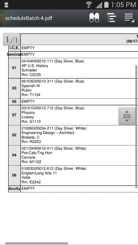
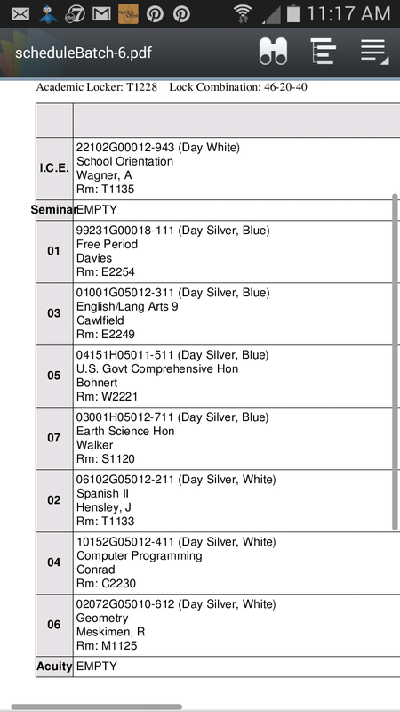
  • We are sending out High School schedules.
  • We are watching the boxes in her room multiply - it's the cleanest her room has been in ages.  As I look at them, I'm not thinking about this being the last load of laundry I'll fold (probably not, but the thought struck me nonetheless while doing this week's laundry.)  I won't watch "The Trio," as she heads out to the movies with her two brothers.  My heart won't contract when I watch her with the 6 y.o.  I won't think about watching "our" shows without her.  I won't look around at my family of six, as we eat dinner, and talk about ridiculous things or share our inside jokes.  I definitely won't be shedding any tears.  I won't.  I'm not.
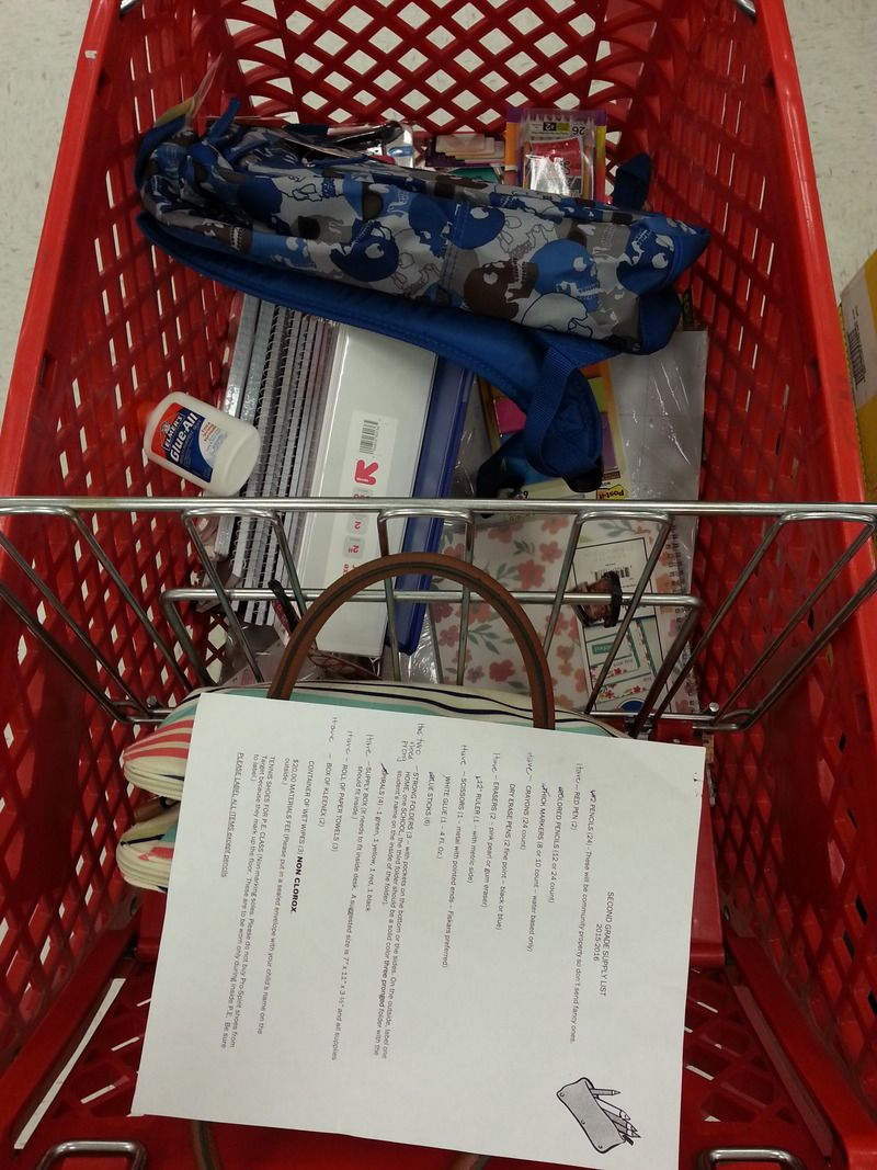
  • We are school supply shopping.  There's only one list (everyone else shops for how they best track their classes) this year. . .so very weird.
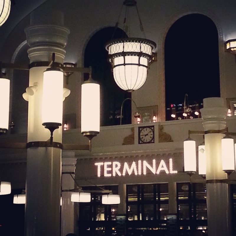
  • We are heading to a Whiskey Tasting at Union Station via Light Rail.
  • We are hiding from Monday.  We can totally relate, dog.
Happy Wednesday,


Tuesday, August 11, 2015

Try It On Tuesday

The heat has moved out for a couple days this week - it'll be back later.  I've noticed a few leaves in our trees that are yellow, and a couple red ones in the bushes.  I also noticed last week that the light had changed, no longer directly overhead and harsh.  It might be because of the smoke in the air from the fires in California, so it was filtered a bit, or it could be the change that signals cooler autumn days ahead.  Whatever, I loved the light.

My weekend was spent in anything but creative pursuits - I tackled my pantry, which was totally heinous.  But now it's beautiful.  I can actually walk into my walk-in pantry.  I can see everything I have.  It's glorious.  And it's crossed off the Big To-Do list!

Now to get my hands dirty with something more creative.  This week's inspiration comes with this color pallet (if you want more inspiration check out the Color Theory board)


I love this color combo.  I'm not sure what it is, maybe it's the lime green combined with the icy blue.  Maybe it's the plum purple.  Maybe it's just all of them together.  Whatever it is, it's just fresh and energetic.


You'll find that exact color combination in the American Crafts #Summer line (top), found in the Smaller August kit.


You'll also find it, though without the purple, in the Bigger January kit and the Heidi Swapp September Skies line (bottom.)


Add a little shade to that color pallet and you get colors fit for fall.  Like the Fancy Pants Happy Go Lucky (bottom) line which was in the November Bigger kit.


Now, if you don't have these kits, why not???  You should be getting Apron Strings kits.  Seriously, though if you can't find this color combo in your stash, use the photo to gather your supplies instead.  Look for popsicle (or ice cream) embellishments - buttons, brads, diecuts.  Grab paper that speaks to this yummy summer treat.  The popsicles here are layered, so look to layer paper, embellishment groups, even different colors and styles of ribbon.  There's frost on a couple popsicles, so try out a white pen for detailing darker elements, use a mist, use up some clear rhinestones or add some white buttons or brads to contrast with all the color.  A few other popsicles have a sheen to them, so go for shiny buttons or epoxy embellishments.  The popsicles are rounded, so think scallops or circles.  Even the wooden sticks remind you to use up some wooden embellishments.

Wrap it all together with a quick PageMaps sketch.  This sketch covers the circles/scallops.  The stitching shown around the half-circles could be machined, by hand or done with that white pen.  You've got the layered ribbon/patterned paper just under the half circles - go all paper, all ribbon or some combination.  Group more items around the title, like buttons or brads, tuck a wooden embellishment under the title block.  Extend this one-pager into two by simply duplicating the design and adding more photos.


Go get your hands dirty.

Happy Tuesday,


*NOTE:  all kits mentioned are on sale.

Friday, August 7, 2015

Food on Friday

I have no idea why, but I didn't do much over the course of the week.  Last weekend, yes, totally rocked the Big To-Do list.  During the week, yeah, not so much.  We'll just say it was too hot to do anything and move on.  

Shoot I didn't even plan a menu.  I know this, but it's always a nice reminder, it is SO nice to have a menu and food on hand when it's time deal with dinner.  As a result of no meal plan, we ordered pizza one night.  When I ran to the store last night for ingredients for a salad, for the 16 y.o. who's work was doing a lunch BBQ, I grabbed fried chicken from the deli for dinner.  Not a banner cooking week for me...or my family.

But I did cook a couple of things.  If you're looking for tried and true, or at least some thoughts on the food, give one or more of these a try.  You can find other things I've cooked from Pinterest on this board.


I needed a side for the chicken (farther down the list) that I made on In-Law Monday.  These Garlic Noodles were easy and awesome.  A light sauce, good garlic flavor.  Because it was a side, even though I was feeding eight, I used the recipe as is - which said it served four.  Everyone got the size of portion they wanted and, in the end, not a noodle was left.  I did opt for thin spaghetti instead of angel hair; angel hair gets too mushy if it needs to sit for even a few minutes, so thin spaghetti is my go to when angel hair is called for.


It was hot, which means even having the toaster oven on adds too much heat to my kitchen.  I needed these No-Cook Chocolate Peanut Butter Bars because the only heat came from the microwave, and that was for 30 seconds.  These were really easy and really good.  The crust was a bit of a surprise.  The photo on the post looks like it had to be pressed into the pan, whereas mine I could spread.  That tells me I may have needed a bit more graham cracker crumbs, or maybe I didn't need them ground as fine.  The blogger also says it could stay on the counter.  There was no way mine were going to be able to do that and not become a mushy puddle.  However, kept in the 'fridge they were no problem.  The crust was soft (as I said maybe a little too soft), and buttery and lots of peanut and chocolate flavors going on. 


Because I had no menu plan going into In-Law Monday, I had to wing it.  I've always got chicken in the freezer, so it was just a matter of finding other staples I had.  Hello Cilantro Thai Chicken.  I always have cilantro - we love the stuff.  I have to say I was a little surprised.  Typically, marinades don't always impart a lot of flavor, some yes, but they seem to mostly cook off.  This was not the case with this dish.  Now, I was able to marinate it for longer than 15 minutes, more like a couple hours, so that may have been part of the reason it was so flavorful.  But I've had meat in marinade for longer than that and you only get a shadow of flavor.  So yeah, it was good!  Really good.  This is the chicken I paired with the Garlic Noodles above.


My daughter hosted a backyard movie night for her "Fam."  A little get-together before everyone started going off to school.  Because of that I had some hot dogs to use up.  My 6 y.o. was near me when I was scrolling Pinterest and decided we needed to have these Bagel Dogs.  Don't let the yeast dough and boiling set you off, it really is easy.  I had a couple things go a little askew for me.  One was not working quickly enough while rolling and cutting - I was distracted talking with my boys, so I should have covered my dough so it didn't dry on top.  I also was under the clock to get them done because we were headed for the neighborhood ice cream social just down the block, so the second rise was about 20 minutes instead of 30.  Some of the hot dogs were still really cold, so that could have affected the rise, despite the heat of my kitchen.  The flavor was good, and they had some good bagel-chew to them, but they were a little more "crusty" on the outside and a little less "fluffy" on the inside.  I have another bagel dog recipe that I've used, so I'm not sure if it was my "issues" or the recipe itself that produced the results I got.   More than likely a little of both.  In any case, because I have another recipe, I didn't keep this pin. 

I have not a clue what I'll do with my weekend (though the state of my pantry is deplorable.)  The 6 y.o. has a birthday party to go to.  We need to top off the college supply list for Girlie.  I probably should go brave the school supply aisle at Target and get that off my list while there's still stuff to choose from.  I'll need to wing some sort of menu for tonight and definitely make a menu for next week because not having one sucks.

Happy Friday,

Thursday, August 6, 2015

Color Theory - Part 2 - Mix 'n Match

Last post (Color Theory - Part 1) we learned about the basics of color; what it is, how we get it and how to group it.  Today we’re going to look at color schemes.

There are six basic color schemes that you’ll typically find noted on a color wheel:  Monochromatic, Analogous, Complimentary, Split Complimentary, Triadic and Tetradic.
Let’s start with the easiest scheme, Monochromatic.  Monochromatic color schemes use one color in various tints (any color + white) and shades (any color + black).  They are among one of the easiest schemes to produce because you don’t have to worry about working with another color.  Playing with textures will provide dimension to the one color look; i.e. for a monochromatic layout, look for buttons, flowers, ribbon, etc. to add dimension to the page.  Black and white photos, and photos with a lot of color or activity, shine when paired with a Monochromatic scheme. 


Analogous schemes, sometimes called harmonious schemes, are simply selecting colors that reside next to each other on the color wheel.  As simple to use as a monochromatic scheme, an Analogous scheme will give a bit more pop.  When using this scheme select one color to dominate and the other will provide the pop and support.


Complimentary schemes are colors that are directly opposite each other on the color wheel.  Using this scheme provides high contrast.  If the photo you’re working with has purple in it, choosing purple is one way to go, but draw the eye to the photos by selecting purple’s compliment, yellow.

Split Complimentary schemes start with one color and then add the two colors on either side of its complimentary color.  Split Complimentary schemes have great contrast, but not quite as strong as the Complimentary Scheme.


Triadic schemes use three colors that are evenly spaced on the color wheel.  Try all three colors in equal amounts, with no one color dominating, and you create a nicely balanced combination.


The last color scheme is the Tetradic scheme.  The Tetradic scheme, sometimes called Double Complimentary, uses four colors:  two pairs of complimentary colors. Because achieving a good color balance when using four colors can be difficult, select one color to dominate or use the method of proportioning called “quart-pint-ounce.”

How can you use color so that it's well balanced?  Think quart-pint-ounce.  Balanced colors help support and highlight your photos instead of overwhelming them.  Quart-pint-ounce works simply:  Select the colors you wish to use.  One of them will be the main color (the quart) that will be used for the majority of the layout, say your background paper.  Next select the color to be used in lesser amounts (the pint) and will support to the main color; a photo mat, a secondary patterned paper used in lesser amounts than the main paper and even the color you journal or print the title in.  Finally, the last color becomes the ounce, the color used the least, but helps add pop and balance; another patterned paper used in much smaller amounts, colored brads, florals, buttons, ribbon, etc.  When thinking in Quart, Pint, Ounce, it’s the overall amounts of each of the colors you use; it’s not just one sheet of red paper, highlighted with blue stripe and white buttons.  For example the Pint color can be several sheets of patterned paper, just in lesser total amounts than the Quart color’s total amount.

Most color wheels found at craft stores come with dials that identify each of the colors in any given color scheme.  If you don’t have a color wheel you can Google "color wheel" and find any number.  Simply print one and start applying your new-found knowledge.  Even without fancy dials, armed with the descriptions of the schemes you should be able to use it like a pro to create your next layout.

Next post, we’ll put the pieces together and show you how different schemes combined with your photos will change the way your layouts look.  In the meantime, play with the colors and schemes and enjoy the experiment.


Happy Thursday,

Wednesday, August 5, 2015
We Are

We are enjoying the last couple weeks before the chaos of school begins.  We are also trying to wrap our heads around the fact that our Girlie is taking off for college.  It's not working.  Denial remains the name of the game.  We are also continuing to plug along with the Big To-Do list; I'm hoping to tackle something off it later this afternoon, and there's still plenty to choose from!


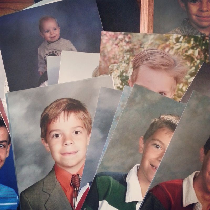
  • We are finally putting the school photos into frames.  Yes, they'll be "outdated" in a matter of weeks, but the point is, they're in there, along with past years'.  It's always a sweet trip back in time as I pull them all out and see how time passes and the faces have changed.
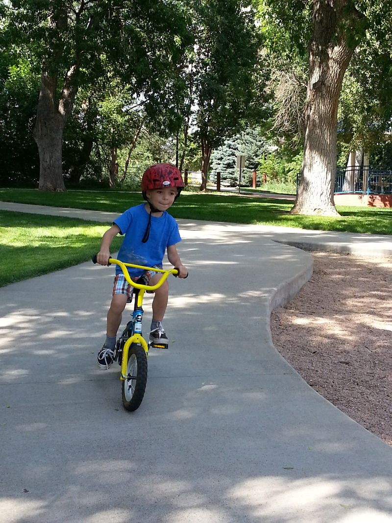
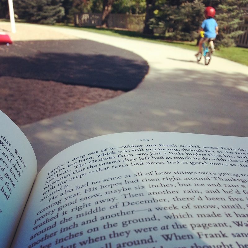
  • We are totally getting this whole riding a bike thing.  No training wheels (we never did those.)  All it took was 20 minutes with a cousin and BAM.  Done.  He now thinks he's Evel Knievel.
  • We are enjoying our thing, while he enjoys his.  (new book:  Some Luck)
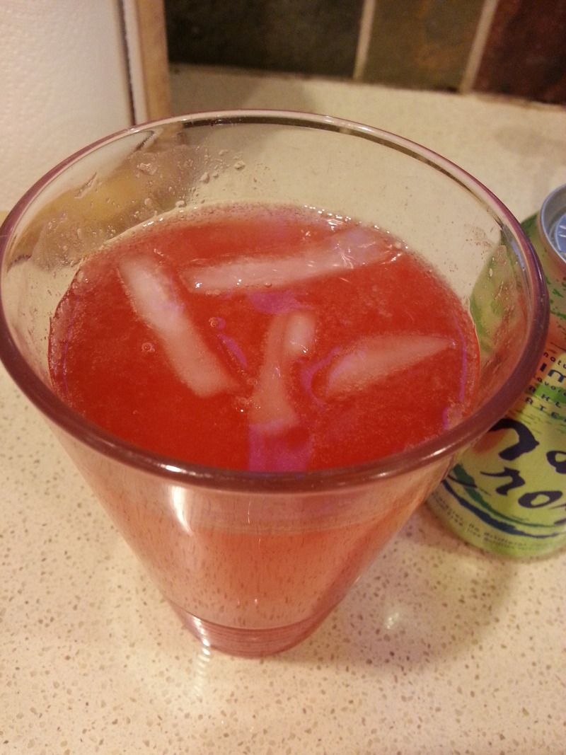
  • We are experimenting with Adult Only Cherry Limeades.  Not a bad experiment, 'cause even the duds are good.
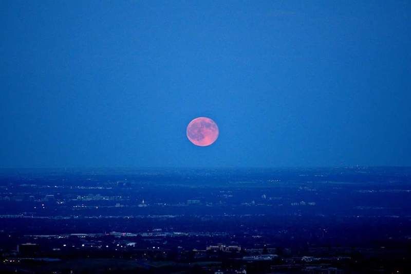
  • We are Blue Moon Rising.  (photo credit goes to the Girlie)
  • We are seeing signs of Fall.  Already?  I love Fall, but if this is true, it will be insanely short and I won't like that.
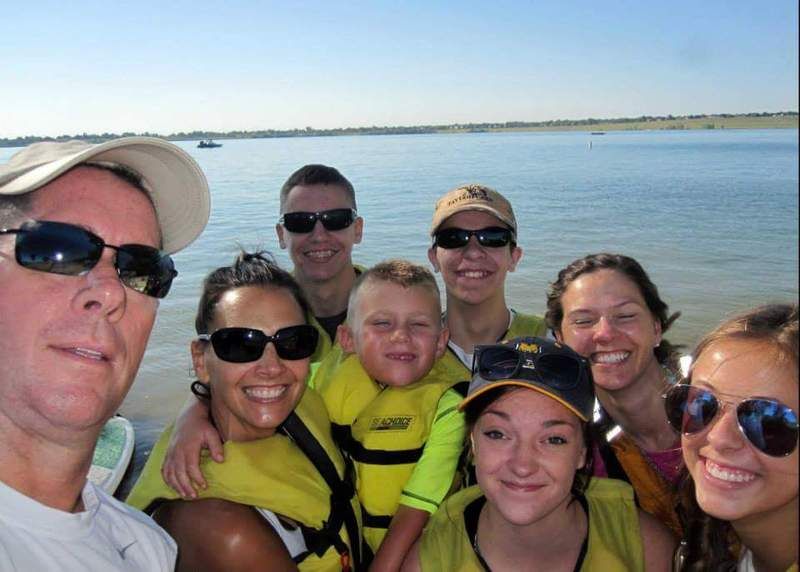
  • We are Kayak'ers (and Paddle Board'ers) on Saturday
  • We are trying to figure out what way to go - by lashing ourselves together.  okay.
  • We are brothers who paddle
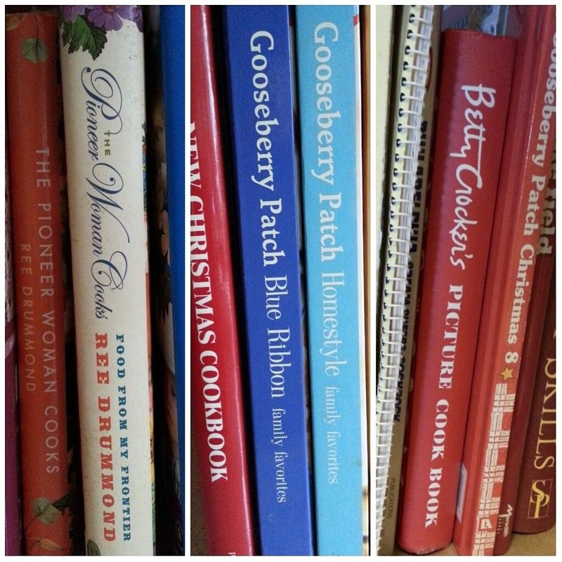
  • We are purging cookbooks, which is like figuring out which kid to give away.  #cookbookcollectorproblems
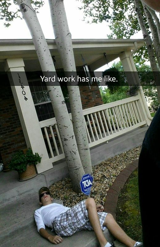
  • We are so over yard work...bring on the snow.
  • We are six and master of all things technical.  Who says males don't multi-task?
Happy Wednesday,

Tuesday, August 4, 2015

Try it Tuesday

Monday, I was recovering from some crazy motivation over the weekend.  It was hot, but quiet, which is probably what spurred the level of activity.  

I spent Saturday purging various spots in the house.  I piled more stuff into the laundry room, which needed purging so I could do laundry.  Sunday it was time.  I'd been denying its existence.  I'd been finding other things to do.  It was getting ugly; really, really ugly.  It was time to face-down the basement, which includes my studio.  I dragged stuff back to the store room and up into crawl space.  I put stuff away.  I moved things around.  I opened up some spots, and overstuffed a few others.  I may have nightmares about really digging in and decluttering 25 years worth of stuff down there.  I'm so not looking forward to it; in fact it's not even a category on my Big To-Do List, yet.  

I have some horizontal surfaces to sort out down there and then I can re-set-up my work table.  And when that occurs I might actually be able to scrap at home, though I do tend to be pretty productive at a crop.  

But, if like me, you're ready to tackle some creative paper maneuvering, I'll get you set up.  We'll start with this color pallet.  You can always work from other pallets, found on the Color Theory board.


These colors are bright and primary based and are what is great about the summer; its vivid colors.  They'll cover you for swimming, vacation, BBQ's, park trips and more.  They'll also have your back for other seasons.


You can find a nice summer example in the August '14 Bigger kit (which might be on sale ;D), and the Fancy Pants Nautical line (top).


Next is a non-summer example.  The Jillibean Holly Berry Borscht (right), from the Bigger December '14 (and this one might be on sale, too), shows you how these colors speak to a much different season.  Besides the Christmas and Holiday theme, the B-Sides will help you add color to snow and winter scenes, where color is a little less lively.


Remember, inspiration is all around.  Just like the photo from this pallet.  The obvious first - water.  Think water patterned paper whether it's waves or shimmers.  Diecut waves.  Wave borders.  Look other water things - boats, beach balls, swimsuits, floaties, etc.  The plastic stripes make me think of all the great enamel embellishments out right now - dots, letters, alphabets, even some papers are embossed with it.  The plastic also has me thinking about ribbons or strips of patterned papers.  Both the water and the plastic in the photos shimmers or shines, so maybe it's time to dig out those misting sprays and either add it to your background or cover and customize some embellishment, maybe one that wouldn't otherwise work with the layout.  There's a transparent nature to everything; hello Washi Tape!

Because you know I love 'em.  A Page Maps sketch.  I mean, look at all the "stripes."  Look to put Washi Tape, if you have it, if not strips of patterned paper, where you see the scallops (black) or even between the photos on the right side, instead of patterned paper.


Now, if you're having to set-up your scrap space, fine, but don't use that as a reason to not create this week.  Drag a kit, a portable self-contained Apron Strings kit, up to your kitchen/dining room table or counter and get moving!

Happy Tuesday,