Tuesday, June 30, 2009

Frozen Treat Memories

I remember, as a kid, sitting in front of the house listening for the ice cream man, with a quarter in hand. We'd be taking part in whatever water-activity was going on that day -- jumping through sprinklers or just hosing each other with, well, the hose. Someone would freeze as they listened for the distinctive jingle of his bells -- not the piped music they have now -- the jingling of a string of bells running between his handlebars. This is back before he drove a truck into the neighborhoods, he was on a bicycle with a big ice cooler on the front of his bike. This was also back in the day when the treats he carried were fresh and filled with flavor (now days they seem to have been frozen for too long -- it's almost dehydrated ice cream.) Back before Sponge Bob had his faced plastered on a Popsicle or ChocoTacos. There were Bomb Pops, Fudgesicles and Orange Creamsicles, Banana Pops and the classic double-Popsicle, that your mom would make you crack in half to share, in orange, cherry or grape -- I can almost taste them now.

Bo Bunny's Popsicle lines remind me of those days. Aside from the line's name, these double-sided papers sport those juicy summer colors and whimsical designs. Add a sprinkle of sugared brads, a length of looped satin ribbon, Bo Bunny cutouts (which are great for journaling or used as frames - just cut the photo to fit inside), a mini tab and a smiley ticket.

This line is just begging for pictures of water park visits, swimming pools with big 'ol slides, beach side vacations, trips to ocean parks like Sea World, amusement parks -- or maybe just a photo of your kids waiting to get their frozen treat from your neighborhood ice cream man.

Photobucket

Thursday, June 25, 2009

Humidity and July Kits

It's raining . . . again. Or still. I'm not sure, I've lost track. Don't get me wrong, I'll take the rain over the 90 degree weather, but the humidity is getting on my nerves. For those of you not familiar with Colorado's climate we are dry -- very dry; semi-arid, high plains desert dry. Our humidity levels are typically below 30%, but lately they've been in the 70's, before the rain comes in. But here, the rain will typically bring relief from the humidity, not add to it. Now stop. Just stop. I hear you all in the humid zones. You're thinking, 70%? What are you crazy? We'd kill for 70%. Yes, I know. I have relatives in Michigan (that we visited on Summer Breaks), in Seattle, Kansas City and in Southern California. I've lived in Houston (not long, but long enough to remember the humidity.) I've been to Disney World and Disney Land, driven through the heartland, camped in a pop-up camper (no fan, no a/c) in Seattle and along Lake Michigan -- I know humidity and I hate it. BUT, for us, here, west of Denver, 70% in crazy high and uncomfortable -- and that's before the storms blow in and crank that level up. It's been this way for a couple weeks now and that is extremely unusual. And frankly, I'm done. This would typically be the type of weather that would drive me to my scrap area -- get cozy down at my desk and crop while listening to the rain pour down and the thunder boom away. A couple days ago I was shooting pictures of the kits for reveals of them here (stay tuned) and I could see the storms blowing in and my fingers actually started to itch; they wanted to dig in and play. I was touching all this great stuff in the July kits and there was rain coming -- it was like the Perfect Storm. Even my nine month old was still sleeping away. Could it get more perfect? Nope. But what did I do -- nothing. Not one thing. The fingers were willing but the mind was not. I hate that! However, as I go post peeks of the July kits here, I'm hoping the mind will engage and I'll be able to create something. . .anything for heaven's sake! Sheesh. The July kits are super fantastic, so I know you'll have a hard time waiting for them, but they will be worth the wait. You'll have to let me know what your plans are for them as you see them in the coming days. Maybe one of your ideas will take root and begin to grow -- heaven knows I've got plenty of rain! Photobucket

Sunday, June 21, 2009

Paper Posies

Have you had a chance to play with the June kit? There are some great papers in the Bigger than a Breadbox kit that are perfect for distressing. I used the Lily Bee papers to make some easy paper posies. Here's how I made them. ***This will be a picture heavy post.*** First, get your circle punches or circle dies, distressing tools and ink. For this tutorial, I used some Sizzix dies, a Heidi Swapp distressing tool and Ranger Distress (Vintage Photo) ink, a brad and Distress Stickles. Next, pick out your papers. I used some leftover scraps from the Lily Bee papers. Punch or die cut 3-4 circles (of gradually decreasing size) per flower. The Lily Bee papers are nice because they are two-sided, easy to get more coordinating circles for your posies. Distress the edges of your circles and then ink the edges. Crumple the flowers in your hand, unfold and then ink the tops lightly (I used a lighter shade of Distress Ink - Antique Linen). Layer your flowers largest to smallest, adhere with either a glue stick or tape runner in the center. (A tip... I've found using a glue dot makes it difficult to pierce, the tool gets stuck and it gets ugly.) Pierce your layered circles in the center. Slip in your brad, and you have one distressed paper Posey! For a different look, take a second set of layered circles and add a drop of glitter glue (I used Vintage Photo Distress Stickles) to the center. Have fun playing with different paper and embellishment combinations! I used Distress Stickles and the rhinestone button to embellish the posies from the June kit on my "Favorite. Photo. Ever" layout. Maria Swiatkowski Apron Strings Sous Chef

Friday, June 19, 2009

The Invisible Family Night

I'm trapped. I'm banned. I'm hidden. It's poker night at my house, but it's "No Girls Allowed." No kids either, so we exited the house before the men-folk showed up. When we'd stayed out as long as the youngest child would allow we came home and came in as quietly as one mom, 3 kids and a baby(who was 2 hours past bedtime) can. Curiosity got the better of the older kids, as they snuck peeks (disguised as "I'm going to my room to get. . .") at the landing that overlooks the family room turned poker parlor. They found the scene below "odd," with "weird" men -- one of whom was their father, so I'm not sure if that was directed at him. To tell the truth, I'm not sure what the fascination was, unless it was just the fact that we had to leave the house and they weren't allowed, at all, downstairs, though there was much pleading and begging. Whatever it was, it was amusing. Would this have been the perfect time to scrapbook -- even if it meant doing so on my bed (the hub of our hideout)? Heck yeah! I mean it was a party in my home that didn't require me to entertain, bag up leftovers or do the clean-up after. Well, I expect that I'll have a fair share of getting the house back to the way I want it, but I'll save the shock of it for the morning. BUT. . .did I bring up anything to work on? Nope. Remembered my 365 book, my laptop and a scrap magazine, but not a single tool made it upstairs. That doesn't mean I didn't work on scrapbooking -- I had my magazine, remember? I read it, semi-leisurely (I had three kids bouncing around on my bed) soaking in the layouts and articles. Even the ads spark inspiration. So, what do you do when you can't scrapbook? Sketch, sort photos, read magazines, surf the web galleries and blogs? All are great ways to scrapbook, when you can't scrapbook. Speaking of web-surfing for ideas, check out the blog on Sunday for a tutorial on Paper Posies by Maria Swiatkowski, one of the June Sous Chefs. The Posies, are totally adorable and super easy to put together. Some come back and "scrap" a little on Sunday. Photobucket

Monday, June 15, 2009

Perfectly Punched!

I had so much fun working with this sketch for June from Becky -as always! I knew I wanted to use my circle punch to make the cut-outs like in the sketch, but there was one small problem: it is almost impossible to line up your paper while it is inside a circle punch to get an even "row" of cut-outs across your paper as in the sketch below. After I cut out my first circle I sat there for a minute trying to figure out how exactly I was going to line up my paper. Well, the first semi-circle cut-out was laying on my table and I had one of those EUREKA! moments. First thing to do is cut out your first semi-circle.
In the next step you will need some type of glue dot or small adhesive square.
You will affix the semi-circle cut-out EXACTLY where you want your next cut to be made. I turned my paper over (white side up) so that you could see it better in the photo.
Now the EUREKA! part. Slip the paper back into your punch so that the cut-out is exactly centered inside your punch area and PUNCH!
And PRESTO! you now have two perfectly aligned punched shapes.
Then repeat the process across your paper until you have the number you want.
This technique would work on any type punch really. You could use a smaller circle and put the punches close together and make your own scalloped border. The possibilities are only limited by your imagination.
Kristi Bergin-Smith
Apron Strings Sous Chef
*Above layout created with products from the June Bigger-than-a-Breadbox kit.
Journaling Reads: "Recipe for a Merry Christmas: To a cup of tradition, time-honored and dear, Add a generous portion of holiday cheer, Combine with the memories of Christmases past, Then sprinkle the mixture with joy unsurpassed. Add a dash or good spirits, stir fondly until... You set it to rise in the warmth of good will. Pour love over all in generous measure, And garnish with laughter and heartwarming pleasure. "

Friday, June 12, 2009

Load 'em Up!

Billing and shipping weeks are hec-tic! But the kits are out, and for those of you getting this month's kits you should see them on your door-steps starting as early as Saturday. With the busy week, it's a good thing this sketch is a quick, easy way to achieve that feeling of accomplishment. And maybe more important, doing something that is for you. We already have one great layout linked in the comment section -- great job Molly! I'm glad you're on a roll in the scrapbooking department. :) Remember, layouts are due tonight by midnight MDT. Photobucket

Monday, June 8, 2009

"Fun"day

Well, not normally. Monday's are usually filled with the drudgery of life -- back to work, back to chores, back to gettin' things done.
Unless, like me, you've become the "Queen of Gettin' Nothin' Done." Oh, I keep up on various things: laundry, daily cleaning, feeding the family - stuff like that. But there's the other side, the NEED to be creative again. My Project 365 was sort of filling that gap; I was doing awesome at it. Staying on top of it. But I've fallen behind -- since about three weeks before school let out I haven't gotten anything done (I have the pictures, unprinted, and no journaling to speak of.) You know that time; the chaos of picnics, parties, programs and projects fill the end-of-year school calendar. There barely seems to be time to breathe let alone do much else. The momentum of getting all that done has you flying into summer break without, well, breaks. You feel like a rider being dragged by a runaway horse, until you say ENOUGH, I want some time for ME!
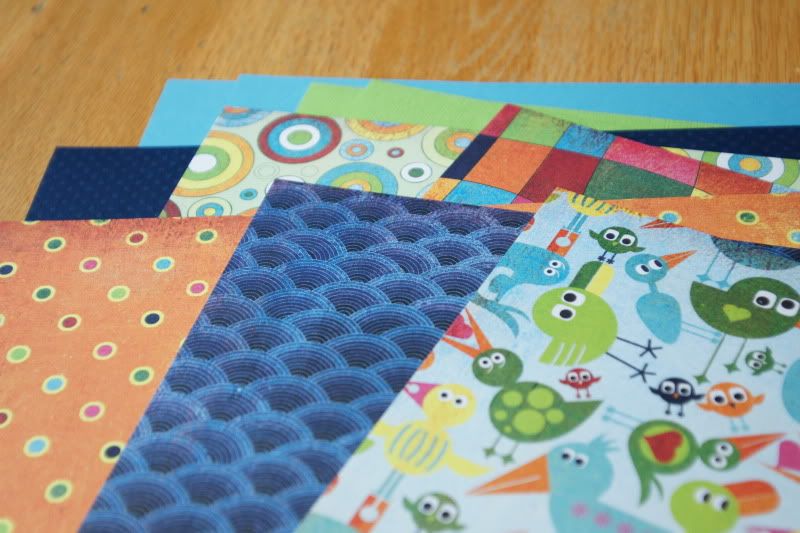
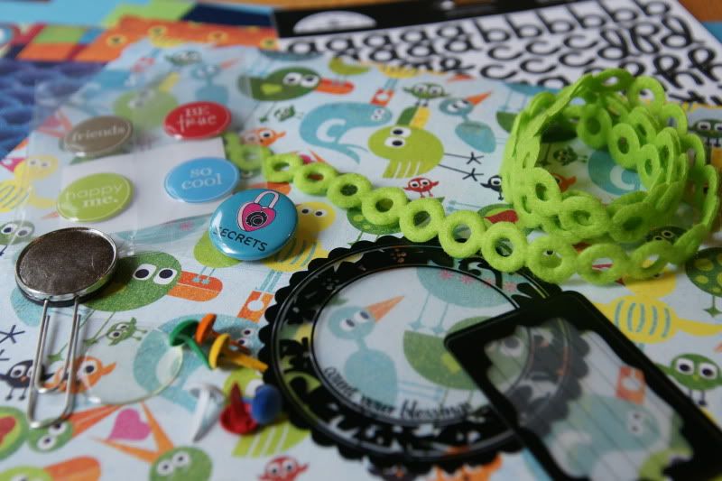
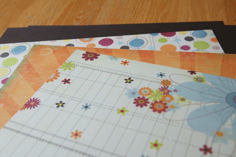
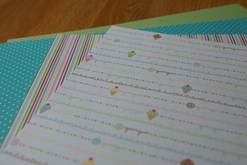
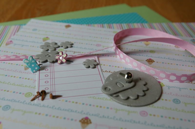
Well, I'm there. Even though I want to get something done, I still need the shove in the right direction. I need something to get me going. I could do some purging, that usually gets the inspiration bubbling away, but so not in the mood. I could browse a magazine or two, but it's been so long since I put photo to paper, that the magazines are a tad intimidating. The next best thing is a good sketch (I love sketches), a kit and some pictures. So here we go, the sketch is from Becky Fleck (http://www.pagemaps.com/) and is one of her new June sketches.

If, like me, you just need something to get you going. Something to make you take a bit of time for yourself, follow along with me. Use the sketch to create a quick page, then leave a comment with a link to your layout and I'll draw a name for a Cookie Jar Treat. Guess I should add a deadline -- by Friday, June 12th.

I know I'm waiting for nap time here, but what are you waiting for?
Photobucket

Sunday, June 7, 2009

Hey, Rickey!

Lime Rickey that is -- one of the newest lines from Basic Grey. (psst. . .wait until you see their upcoming releases -- OMGoodness -- yes, we'll have them!!) Anyway, on to the last, but certainly not the least, of the June paper lines. This one is in the Bigger than a Breadbox kit. This bright and bold line just screams summer, or at least yells late spring. The quirky birds are simply fun and the full spectrum of colors has me thinking about swimming pools, Popsicles, sprinkler runs, theme parks and zoo trips. I think it's because all of them are filled with color and some activity, which is what these papers are all about.

With papers this fun we have to have equally fun embellies to go with them. So we happily oblige. There's a sheet of dotted swiss paper (perfect for a little sandpaper action to pop those dots), a set of word pebbles, a magnetic over-sized clip (you could put the word pebbles on the top), a length of lime felt ribbon, a couple sheer cards, a flair button, cardstock stickers, mini sheer birds (the birds and stickers aren't shown) and some velvet brads. Lots of great textures and layering potential.

What photos can you pair these papers with? What photos can't you pair these photos with! School activities, sports activities, birthday parties, personality photos (pictures of loved ones where you "capture" them) and ANY seasonal shots. One designer's used them to feature a hula-hooper and a great kid mis-quote. You'll be able to see all the fantastic layouts in the upcoming June newsletter and we'll probably show off just a few of them here -- keep a look out. Photobucket

Thursday, June 4, 2009

D-E-Lightful!

I'm not sure what about orange I can't get enough of, but the color is energizing. It's warm and cool, it's fun and juicy and it's just one of those colors that I love to use all year round. So naturally it appears often in the kits. This month it's in the Fancy Pants Delight line, found in the Smaller than a Breadbox kit. And it is just that. . .Delightful! First, I love that the papers are double-sided -- with usable designs on both sides. Next the colors are so fantastic -- lime green, ocean blue, cherry red and, of course, orange! That sunburst paper is . . . ahhhh , then there's more of that great lined notebook paper, which I really like. The design on the one side is just begging for embellishments like a little bling in the centers of the smaller flowers or along the dotted lines of the flowers, or some handmade layered paper buttons scattered to give a little texture. I can see it in my head now.

The papers were looking for fun little touches, so we added the new Basic Grey Bling It, in orange and scarlett. Those little gems are nice and clear which gives lots of nice sparkle. Add a word pebble, a mix of felt and chipboard flowers (the felt flowers are some of my favorites because of the nice clean edges), some of the Fancy Pants borders (which are reversible to an orange print on the back, just in case) and then a journaling sheet from the Delight line.

As with a lot of flowers in scrapbooking these days (trust me, it can be hard to avoid them), don't let them lead you to think only about girly layouts. Flowers are just an accent which work for layouts about trips to the zoo, a field trip (as one designer did this month,) the first day of school (or even the last, as another designer did), graduations, parties of all kinds or any day in the sun. If the flowers just don't work, remember these papers are double sided, so open your photo box, grab and go. Photobucket

Tuesday, June 2, 2009

Sweet Treats - Yum

Who doesn't like something cool on a hot day? Whether it's ice cream, sorbet or frozen yogurt, that cool delight on the tongue is sometimes just what you need to make it through a scorcher. Gone are the days of the neighborhood ice cream parlor, or soda fountain, at least here where I live. Oh, we have the Baskin Robbins, or Cold Stone, and even a Russell Stover that serves ice cream, and they're good, but the feeling isn't the same. You have to head up into the mountains to find a true parlor, with the iron-work table and chairs painted white and those pastel parlor colors, with the shining chrome accents and curtains at the windows. However, there's no need to drive far to get that ice cream parlor feeling - you just need to get your hands on the June Smaller than a Breadbox kit. I'm sure those old fashioned ice cream parlors are just what Doodlebug (one of my all time favorite manufacturers) was thinking of when they designed their Sweet Treats line. All those great pastels cover the papers and have you thinking of the long-gone parlors and the sweet, cool treats behind the glass cases; chocolate brown, pink strawberry, green mint, blue raspberry, and cherry.

Like sprinkles on top, we've added just enough to finish your layout: some mini chipboard flowers, boutique brads with a little glitter to catch the eye, a naked calendar turn (just waiting for you to customize to your layout), some pink polka-dot ribbon, a journaling card and a dash of mini brads.

When it comes to layouts, there are several possibilities beyond photos of folks enjoying their ice cream treats. We actually have two designers (with great minds that think alike) who used the line to highlight the "sweet" connection between siblings. Think birthday parties for girls AND boys (don't let the pink throw you.) The colors are perfect to highlight summer sleep-overs, friendships, first loves (even if that love is chocolate :) and any other "sweet" connections or moments you may think of.
Photobucket