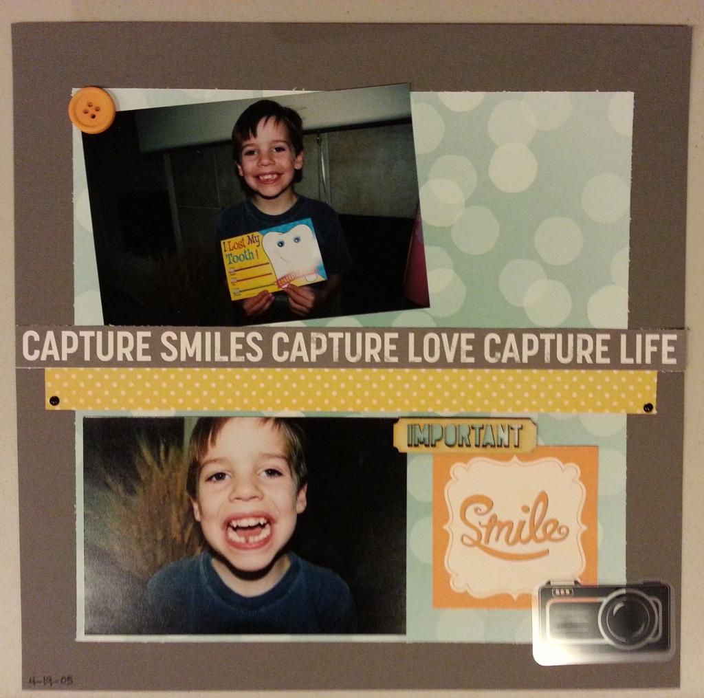
So these classes are helping me to get a lot of pages done, and using my supplies; both are really good things. Because I've yet to print more Project Life® photos, I'm getting some traditional layouts completed.
Most of the sketches that come with the classes are single pages, which I don't typically do, but I'm finding they are coming in handy for those events that only have one or two photos. I usually pass over these kinds of events because I always feel the pages are empty, too much white space, and not in a good way. I guess it comes from working with a 12 x 24" (aka a 2-pager) canvas more often than not.
To tell you how old these photos are (this is the "throw back part"), that's my now 15 y.o. losing his first tooth. My goodness. I had several pictures, but they were basically all the same, so I selected these two and set about to embrace the single pager. I stuck true to the sketch and didn't crop the photos. The addition of the 10 x 10" background shrunk my working space down and that combination left the page feeling more complete to me; more full.
I used the remainder of the Smaller April kit, the October Afternoon Snapshots line. I used parts of the kit on another layout and so there is nothing left of this kit. Not even enough to create cards. Gotta like that.
Happy Thursday,


No comments:
Post a Comment