Step back to July, 2011. These were the kits being played with - I may have a couple sheets left from one or two of these kits. If, like me, you do, too, go dig them out and plan to play. And soon.
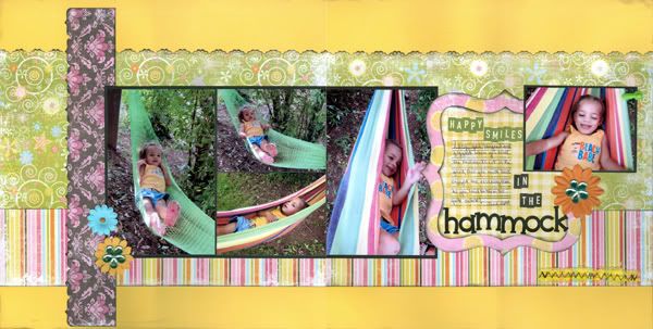
This layout not only used Fancy Pants Beach Babe, but the sketch from that month as well. This line was bright and distressed and felt like you needed an ice cold glass of lemonade at your elbow as you worked. Aside from using a good amount of patterned papers (hello, used up kit!) you can split the design for a one-pager, you can add additional photos to the left, or get smaller photos in place of the large ones (or a combination of large and small.)
Jillibean is one of my favorite manufacturers. Their Watermelon Gazpacho Soup was/is great. The colors, the graphics, it is just fun (I wish I'd picked up the stamp set!) The line helped create this clean and simple layout. Actually, this layout could be a take on the same sketch from above. If you like a little more to your layout, you can continue the strips of patterned paper across the layout, or add journaling strips below the four-block of photos. Use buttons or brads to "hang" the swimsuit line. You could also layer a small grouping of embellishments between the larger and smaller photo blocks.
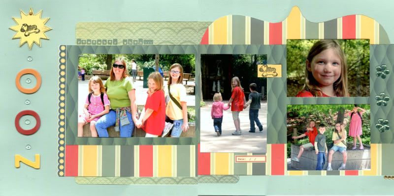
Cosmo Cricket's Salt Air had a bit of a water/ocean theme going on, but because of its "B Sides" it is much more versatile than that. Here the summery colors helped tell the story of a trip to the zoo. Change the Bracket-shape to a circle if you don't feel like free-handing. You could also use another patterned paper for that spot. Divide the larger photos into smaller photos to get more to a page.
Here the same Salt Air as above is put to the water test, and it passes in flying colors. The hand-cut splashes, from the patterned paper, are a great way to use larger graphics instead of cutting the paper down or trying to arrange your photos over the design while still seeing the design. This one-page layout allows for more photos, should you choose. The layered grouping at the bottom is a great way to use a variety of embellishments out of a kit.
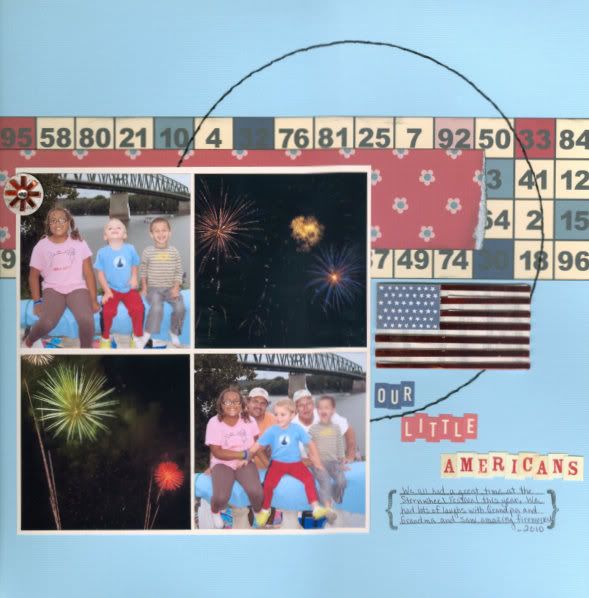
We'll wrap it up with Jenni Bowlin's Be Our Guest line. This layout is also clean and simple, but the feel of it differs because the patterned paper used is more graphic itself. A simple hand-stitched circle connects it all. This is a great layout if you're using a combination of pocket-pages and traditional pages; the grid layout pairs nicely with the pockets. You could also do two more square photos to get more on the page, just move the title up or below the extra photos.
I'm already starting to look ahead to the weekend, and I'd like very much to work on a page or two myself. I've heard "fishing" mentioned a few times in the house, which would give me uninterrupted time. The gear from last weekend's trip still clutters my entry way and I'm telling myself it's not because they were lazy (or worse, figured someone else would take care of it), but because they planned to use it again, soon.
Happy Thursday,


No comments:
Post a Comment